Proving the value of the design team
2023.
Responsibilities
Design leadership & management

At the end of 2022, Seven Bridges, Pierian & UgenTec have combined to become Velsera. After the merger, one of the biggest challenges was following the new unified working process because people used to follow the old working methods.
Pierian and UgenTec hired designers only a few months before the merger. Until then, product managers were creating design solutions.
When the designer from Pierian joined my team after the merger, he often complained that product managers tend to propose design solutions and request that he focus on UI execution. As this working process did not align with the design process we wanted to follow across Velsera, we had to improve it.
I discuss below how we managed to demonstrate the value deisgn team could bring to the product development team.
Better results screening workflow
After several meetings, we agreed that Product managers should focus on problems and functional requirements and give designers the freedom to propose solutions.
Even though things started to improve, a couple of months later, the designer from Pierian resigned. The critical project he was working on was half-done, and we did not have time to wait for a new hire to continue this work. I decided to support one designer from my team in completing this project. This was a great opportunity to further improve the collaboration model and working practices with product managers.
First, we scheduled weekly meetings with product managers and software architects. One of the issues we faced was that product managers, instead of product designers, used to present design solutions to stakeholders and collect feedback. We found this inefficient, as designers did not get firsthand feedback and were not accountable for this phase of the design process.
To solve this, we started holding meetings (Design verification sessions) where designers presented the design solution and directly collected feedback from stakeholders without product managers as intermediaries. As a result, designers could collect more valuable feedback by directly communicating with stakeholders, and they started being accountable for confirming if design solutions solved users' problems.
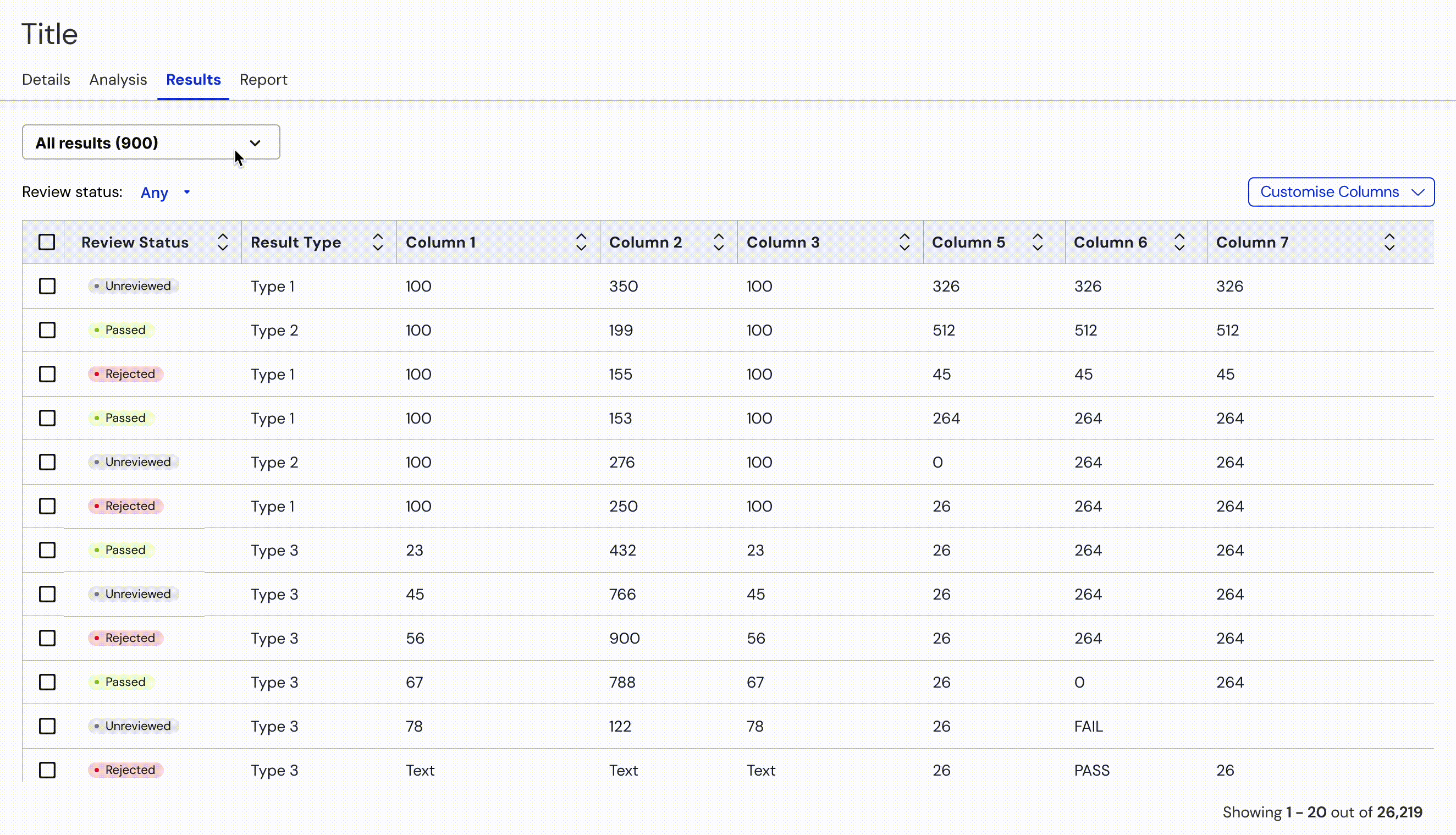
During the first design verification meeting, we presented a design solution based on the work that the previous designer started. Use cases covered with the design are:
Users create multiple queries to filter out results. Some results will be automatically included in the PDF report. Some results require someone to manually review them and decide whether to include them in the report.
A manual review of the results was the primary focus of the design solution.
The wireframe below. To do a manual review, users had to select a query from the dropdown, use the review status filter above the table to filter out unreviewed results and perform the review.
The feedback we collected during the first verification meeting made us realise that the initial user flow and requirements should be improved and simplified.
We suggested having three groups of results:
- Manual review (users have to decide about including them in the report),
- Automatically passed (automatically included in a PDF report)
- Automatically rejected (automatically rejected from a report).
For every group of results, users should create a query.
The first thing users should see is a manual review group of results, as we wanted to direct users to the most important thing they needed to do. Besides that, we could group results by type (represented with tabs in the UI) for easier review.
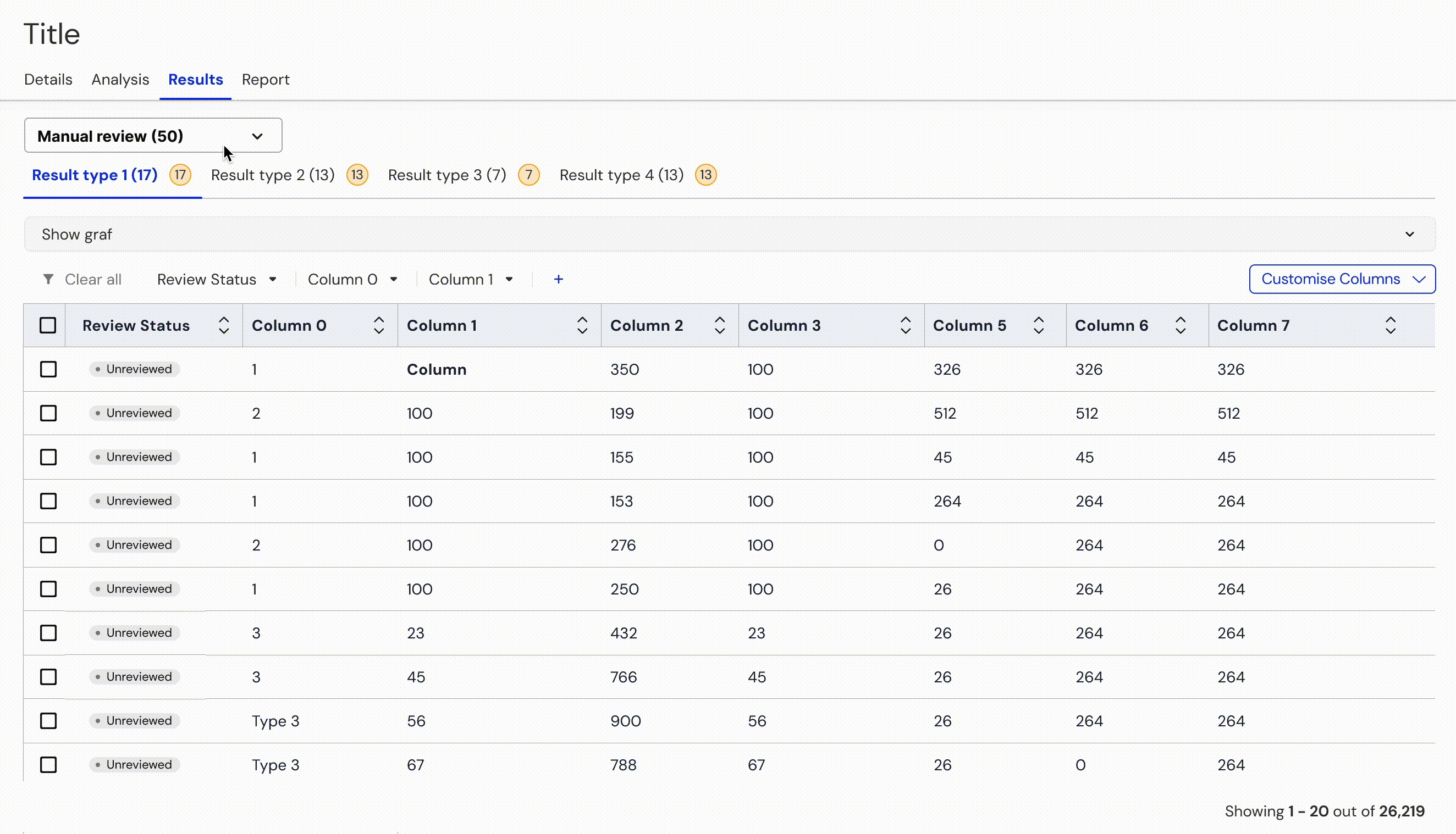
We tested both solutions with internal users who preferred improved solution. After this, product managers accepted our solution and updated the product requirements accordingly.
Refining visual representation of a query
Another issue we faced was misalignment with software architects over the solution of a graph representation of filtering operations.
The problem that needed to be solved was visually representing the query as a graph.
Solution architects and product managers created a UX solution that was most optimal from the technology perspective. Our task was to create a UI design. Before creating a UI, we first needed to understand the solution they came up with and their decisions.
The query that architects used to visually present is the following:
F_1 = "abc" AND F_2 IN ("abc", "def") AND F_3 IN ("xyz", "lkm")
AND
( F_4 < 0.25 OR F_5 is null )
AND
F_7 > -0.9 AND F_7 < 0.05 AND F_8 = "xyz"
AND
( F_9 > 100 AND F_10 > 0.05 OR F_9 > 50 AND F_9 < 100 AND F_10 > 0.1)
AND
F_11 > 250 AND F_12 > 0.02
And their solution is shown in this picture:

After the analysis, we realised this solution is too complex from a user perspective.
We come up with a much simpler solution to the same problem. First, we specified rules defining how we should visually present AND and OR operators.
AND operator
Series connection (only one path)

OR operator
Parallel connection (branching)

By following these rules, this is how we can visually represent the query from above:

To confirm whether our solution is more user-friendly than the one the architects proposed, we organised another design verification meeting to test both designs with internal users. 98% of users preferred our solution, and product managers and architects accepted it as it was easier from the users' perspective.
By completing this project, product managers realised that the design team could improve product requirements and create better design solutions by applying an iterative design process. We also managed to unify working processes across Velsera and position the design team as a critical partner in product development process.