Air Serbia Redesign
2014 - 2015.
Responsibilities
User Research, Information Architecture, UX, Web Design and Prototyping.
Intro
Jat Airways was a flag carrier of former Yugoslavia. In October 2013 it was reorganized and renamed Air Serbia after the strategic partnership Government of Serbia had made with Etihad Airways.
I joined their newly formed e-commerce team in May 2014 to design and develop a new website for Air Serbia, and my journey into the complex world of the airline industry began.
The new webiste was launched in May 2015 and we received a lot of positive feedback on the usability, design and structure. The main goals were achieved: the numbers of visits and purchases have grown, as well as the purchases-to-visits ratio. Online booking now amounts for a substantial portion of all ticket sales, as the new website can be viewed from both mobile and tablet and the newsletter subscriptions have tripled.
Identifying problems
Ideally, an airline company website should cover all three phases of the passenger journey: before, during and after the flight. In other words, the website serves to:
- Inspire and motivate potential customers to buy a ticket
- Direct customers who want to buy a ticket to the right user flow
- Direct customers who already bought a ticket to the right user flow
- Convey company's brand and identity
The former website was failing at these requirements.
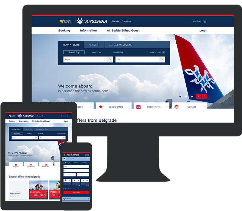
Homepage
This is how the former homepage looked like.
The first impression is that the page is cluttered.
In the visual hierarchy, there are a lot of evenly weighted items, for example, flight search widget on the left and slider on the right. Also, the visual progression and the prioritization has not been done correctly. The box for communicating important travel advisories is placed under the big slider, the image link to the careers page is unnecessarily big.
As for conveying the company's brand and identity, the design of the homepage wasn't following the brand guidelines, and there was no section for promoting the Air Serbia product.
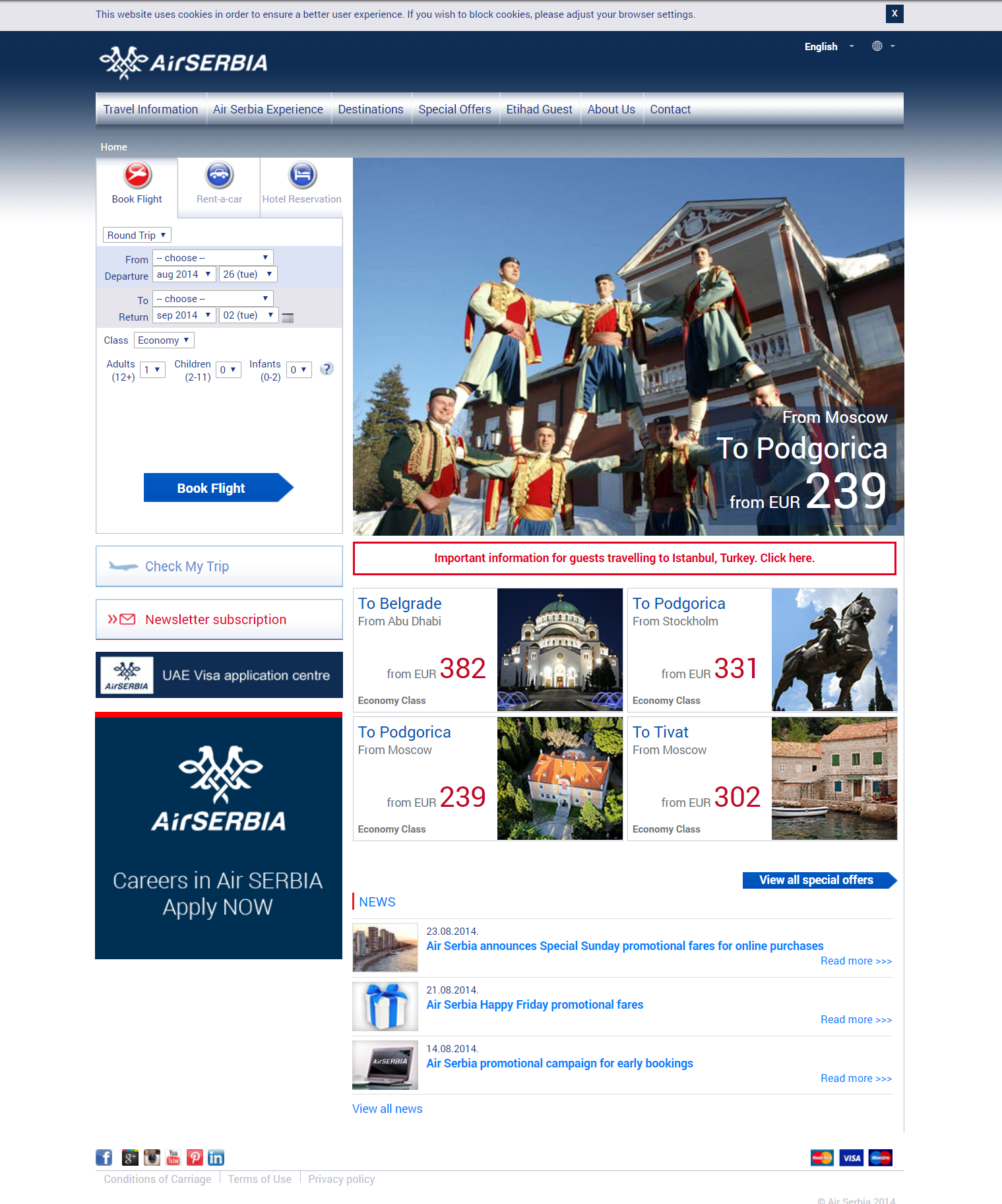
Flight search widget
Every booking process starts from the homepage, where the flight search widget plays the crucial role.
On the former website, the flight search widget had a lot of pain points.
The selection of origin and destination, and date selection should be separate consecutive actions, but in this case, the user first selects origin and departure date, following by the selection of the destination (and return date if it's a round trip). There is an option to select a date from the calendar widget, but each button for date selection has a dark blue border which makes them hard to read. Choice of origin, destination, trip type, and class has been made by choosing the option from the select box which can be tedious.
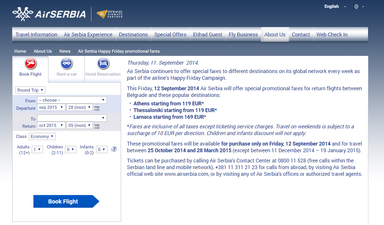
Flight offers
For potential customers, flight offers are of great interest, therefore Air Serbia has introduced time-limited offers. The problem was they were communicated as press releases, and if the customer wants to purchase the offer, he had to populate flight search widget with the data communicated in the news article.
Information pages
When it comes to the content on information pages, it was difficult to read (the line length around 140 characters) especially on mobile or tablets, as the website was not responsive. On the other hand, the tone was too formal and too complicated for the common user to understand.
To summarize the problems:
- complicated flight search form
- the unclear and complicated way of booking flight offers
- hard to read and unclear content on information pages
- website not adapted to mobile or tablet resolution
Competitor analysis
Analyzing the competitors we wanted to learn how our competitors handle recognized problems and to learn from the best practices. We analyzed the usability of the flight search form, number of clicks needed to initiate flight search, the organization of the flight offers, content structure and adaptiveness to smaller screens.
| Airline | Number of clicks to initiate flight search | Usability of the flight search form | Organisation of the offers | Information pages | Website responsive? |
|---|---|---|---|---|---|
| Air Serbia | 8 | poor | poor | poor | no |
| Wizz Air | 4 | good | poor | good | no |
| Swiss | 4 | great | very good | great | yes |
| Croatia Airlines | 5 | poor | poor | poor | no |
| Lufthansa | 2 | poor | good | good | dedicated mobile |
| Etihad Airways | 1 | poor | good | poor | dedicated mobile |
Information architecture
As the website's primary purpose is to search and book flights we decided to make two separate hierarchies. The first one contains all the relevant information for the passengers, and the second one contains all the information related to the Air Serbia as the company.

Redesign
The main goal was improving the number of initiated flight searches, therefore, our main focus was improving the flight search widget.
Flight search widget
I did a lot of sketches to explore and find the best solution to the pain points. After a few iterations, we decided to go with the form which is collapsed when homepage loads. This means only input fields for selecting origin and destination are being visible at start. When the user clicks one of the input fields, the form expands filling the entire width of the website.
I made high fidelity HTML prototype, which we tested internally between our coworkers. Based on our findings, we made some visual changes, included the backdrop overlay which appears when the flight search form expands. This way nothing distracts the user from filling in the flight search form.
Improved selection of the Origin and Destination
We also included the autocomplete functionality for the selection of the origin or destination, which provides the ability to search by destination name, airport code or country.
For the users who don't like to type we included the option for selecting the desired destination from the list.
Improved selection of the dates and passengers
For the selection of the dates, we included the two-month calendar view, with date range selection for the round trip journey which saves us 1 mouse click. Again we included the option for typing in the date if the user prefers the keyboard.
We also improved passengers selection, by replacing the select boxes with input fields which have +/- buttons. This way the user could type the number, or press the desired button for picking the number of passengers.
Mobile layout
We made flight search widget full screen on mobile resolution as well as the fields for selecting the origin, destination and the dates.
Special offers
We organized each promoted destination to be presented as list item which expands on click. As the origin and destination are being predefined, in the expanded area the passenger should simply choose dates and passengers, and initiate flight search in order to book that particular discounted destination.
As these kinds of offers have restrictive rules, and the promoted price is not being offered for every combination of the dates. We wanted to prevent the scenario where the user chooses dates on which the discounted price is not being available. To accomplish this we highlighted dates on which the promotion is available, and disabled those dates on which the promotion is not available. Finally, the restrictions which apply to the offer are being positioned within the expanded area so the user could easily see them.
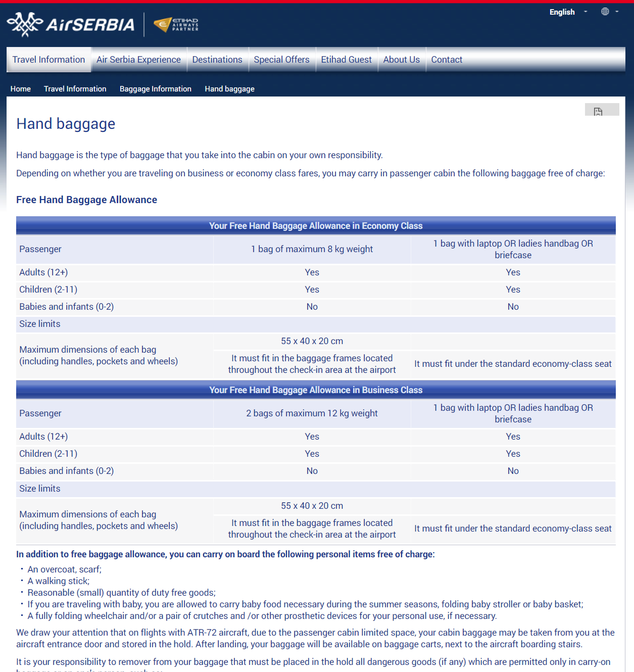
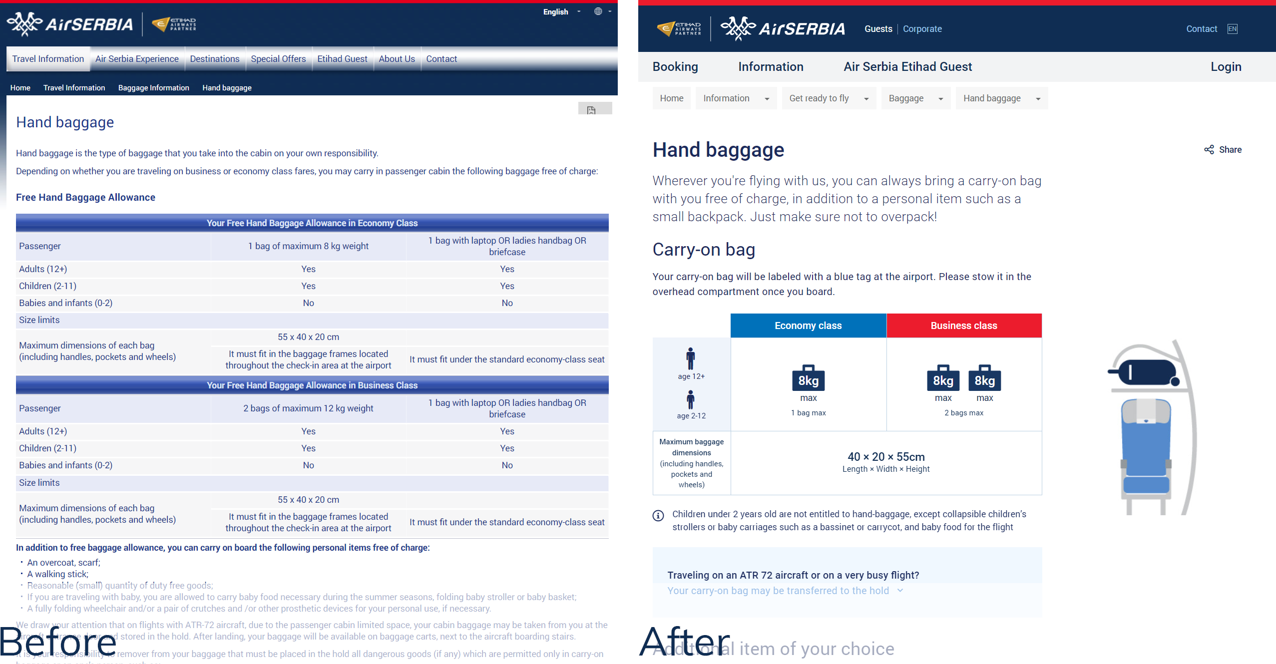
Content structure
Another negative feedback we received was related to the content. The tone was too formal and difficult to understand. The most searched and visited pages are the ones which contain information related to Baggage and Contact. I've conducted a lot of meetings with colleagues who work in the Conditions of travel department and tried to make the content clearer to the passengers by providing the key information at first and trying to present it visually.
TL;DR
After 9 months of work we published the beta version of the website along with the current one, and invited users to give us feedback. Almost 80% of all feedback was positive, and most of the negative feedback was not related to the redesign at all.
Finally, the new website was launched in the middle of 2016.
The outcomes were positive
- intitiation of the flight search increased over 20%
- number of newsletter subscribers has grown over 60%
- increase of purchases on mobile and tablet was increased over 50%
Accessiblity
When Air Serbia began its operation to the USA, we needed to make the website WCAG 2.0 compliant which means following a set of rules in order to make website accessible. Some of the most important was making the website accessible by keyboard, adjusting color contrast between the background and text color, including options for stopping animation etc.